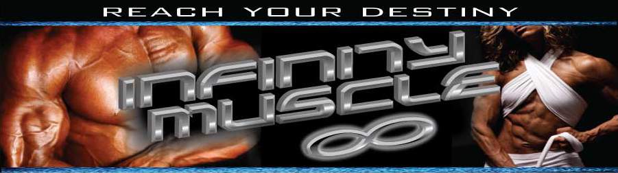
I was doing some work last night and came up with this. Let me know what you all think. This isnt the header just a banner sig. I'm working on a new header soon
Printable View
I was doing some work last night and came up with this. Let me know what you all think. This isnt the header just a banner sig. I'm working on a new header soon
Not feeling it brotha....:confused:
Not too shabby, bro.
just a sig banner not the headerQuote:
Originally Posted by SYNTHRO-RX
looks cool ....
Seems iight to me, Boss.
Good impact
not bad bossman
idk,i kinda like it.don't forget,it's not the finished product.a few places changed theirs.it just takes some time gettin used to that's all.looks good.
wish i was good with this shit FUZO and i'd give ya a hand...
E-STEROIDS GIVE YOU E-BALLS!!!!
http://i855.photobucket.com/albums/a...ettoughguy.jpg
Definitely need to get rid of the cartoon characters (or at least change them, modernise them, whatever) and sometimes simpler is better. With that being said, I like the plain solid text in front of a colored background.
But I think the flame motif has been done a few times before.
Got anything else?
yeah but its just ht sig banner that doesnt have to be to flashy but the header wil look great
Doesn't look that bad, might want to lighten the background color so the ES pops more. Maybe shadow the ES wording?
Its going to be nice to see this old board get a face lift!! Thanks Fuzo.
Pretty good Boss!!!!
hahahahahahahahahahahahQuote:
Originally Posted by incrediblehawk
looks great! Fuzo if u would like some help with your header here let me know i have some great looking pics and am pretty good with photo shop:D
Doesnt look bad, but it could use some work. I think Id give the letters a steel plate design, or rap them in barbwire or something. That would give it the final touch with a more professional look.